TWICE as NICE…thanks to working with my twin sister Rosanne Palmisano. Super fun to help Daniel, the new owner of the Dunsmuir Inn (now The Angler Lodge) in Dunsmuir, California.
With this SUPER BUDGET FRIENDLY mini-makeover, together, we show how you can STILL have BIG RESULTS with LESS TEARING OUT. :)
ENJOY THE BEFORE AND AFTER FUN! XOXO Joanne and Rosanne
BEFORE: A very respectable room… just no pizzazz.
AFTER: Now we’re talking!!
We kept the furniture because it was in good condition, as well as the new mattresses… but updated the paint, walls, and added a dramatic wallpaper on the bed wall. We got rid of the upholstered furniture and rearranged the space to have a little more room around the pieces and have the space be more inviting. We also added relevant decor. Voila!
BEFORE: Again, not bad, just nothing to grab you and saying — STAY HERE! :)
AFTER: Now we are talking! Seriously people, it is not rocket science, pillows that fit the bed, two per person, a custom (washable) throw pillow, a little greenery, a modern lamp, and a dramatic wall covering… just a couple of changes — makes this furniture look totally different.
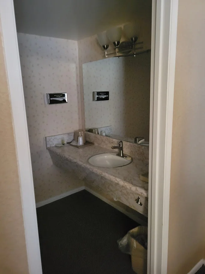
BEFORE: A bit outdated for sure. Also — not utilizing the space to its best potential. Lights directing to the ceiling — certainly not going to help us put our makeup on. :)
AFTER: Still keeping the cost down, we changed out the counter to be real stone, added a wider apron for a more modern look and a shelf below for a bit more storage space. We changed out the paint colors, including an amazing datum line around the room, a better light fixture to really light up the space and more relevant art (it is now, The Angler Lodge).
BEFORE: The coffee machine was in the bathroom, the TV on top of the kitchenette, a light in a weird location… a lot to unpack here. But Rosanne and I had some ideas…
AFTER: We added a datum paint line around the room, except for the wallpaper wall (an easy and affordable way to add drama to a space). Then we used the same electrical box where the wall sconce was and “swagged” a light fixture to be over the kitchenette area. We moved the mirror to be behind the door. We hung up a larger TV and in the suites we added a table and some stools (the other rooms have benches). Now we can hang out and enjoy our dining area.
BEFORE: This lobby did its job, it was a space to check people in and that’s it. But now, a self-check-in motel, we didn’t really need the space, so how could we turn it into something the guests would enjoy? Hmmmmmmm…. thinking…. thinking….
AFTER: By creating an adventurer’s library of course! Being right on the Sacramento River, some of the best fly fishing in the country, backed up to Mt. Shasta, amazing hiking and more — we really wanted to speak to the area — and all the incredible sports and adventures available to guests. So with the same wallpaper we used in the rooms (bringing it all together), some rustic industrial style shelving, relevant decor, local area informational books, and super cozy seating in the middle of the space — guests can come in here and relax, grab a book, or do a little work. Our goal was to make it look like a luxury fishing lodge from the past… how did we do? :)
BEFORE: We didn’t want to make any big changes to the exterior, it was not in the budget, and the building was recently painted so it was in good condition, but a small change would not go amiss.
AFTER: Just a simple change of the door color transformed the exterior look of the building. Bring the bold blue from the inside out.
BEFORE: The Porte-cochere (a structure for vehicle passage) is no longer needed. What to do? What to do?
AFTER: Why turn it into a Portico (a structure for human entry). Simply add some blue Adirondack chairs, a gas firepit, potted greenery and voila, instant gathering spot for guests.
HOPE YOU LIKED THE BEFORE AND AFTER… HERE ARE A FEW MORE SNEAK PEAKS OF THE DESIGN CONCEPT…and DETAIL PICS.
Rosanne and I worked together to create the concept for the mini-makeover. Here is a page from our Vision Board.
Simple sketches help convey ideas…we love old school ways!
The details matter!! Custom pillow design from an upholstery grade fabric (with zipper for cleaning), a unique blanket and local relevant art! All put together beautifully.
AFTER: The Head Shot :)
LOVE IT when I get to work with my twin sister on Design Projects (Joanne on the left, Rosanne on the right).
Need to see more of our projects… Check out our BOOK!! Rock Your Rental, Style, Design and Marketing Tips to Boost Your Bookings — not just for the vacation rental market — but for anyone who wants to refresh their spaces in a budget friendly way. It is only $20 Bucks on Amazon.
Ciao for now! Joanne and Rosanne (the dynamic design duo — just made that up).
We hope you Get Inspired by our Boutique Motel Mini Makeover :) Joanne and Rosanne


